Art direction

Tesson

The identity of a tableware ceramics studio.

Year
2026
At the studio
Logo, colours, typography, labels, packaging, stationery, market stand, website, social media

Tesson is a workshop making hand-thrown stoneware tableware, sold at the workshop, at markets and online. The project shows a complete identity, from the label to the market stand.

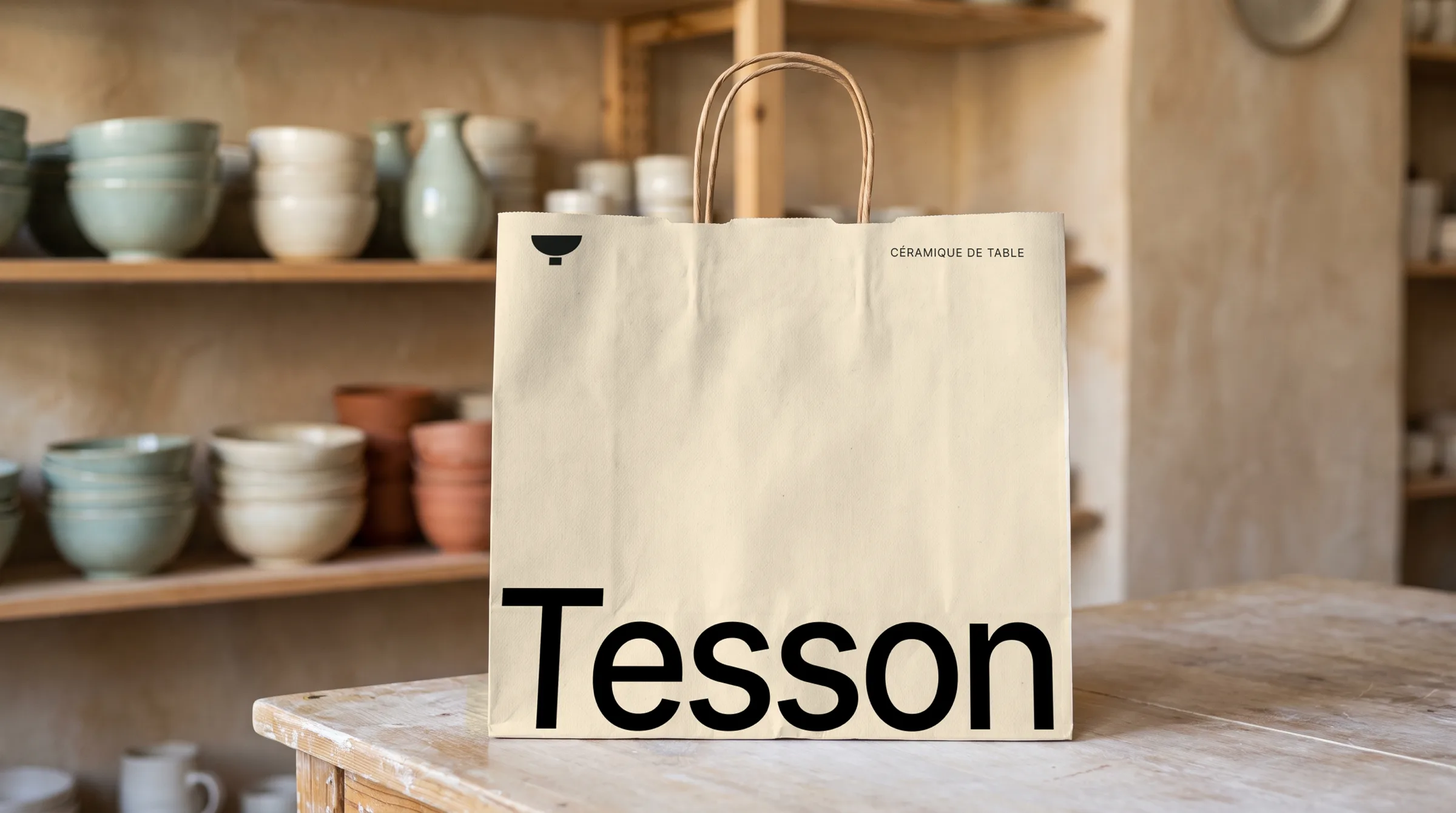
The logo is a bowl standing on its foot, drawing the T of the name, followed by the name in small capitals. The rest takes very little: a single ground the colour of fired clay, a sans serif set very large, one-pixel rules and one photo per page. No bright colour is added; the celadon green comes from the glaze of the pieces photographed.

The guidelines
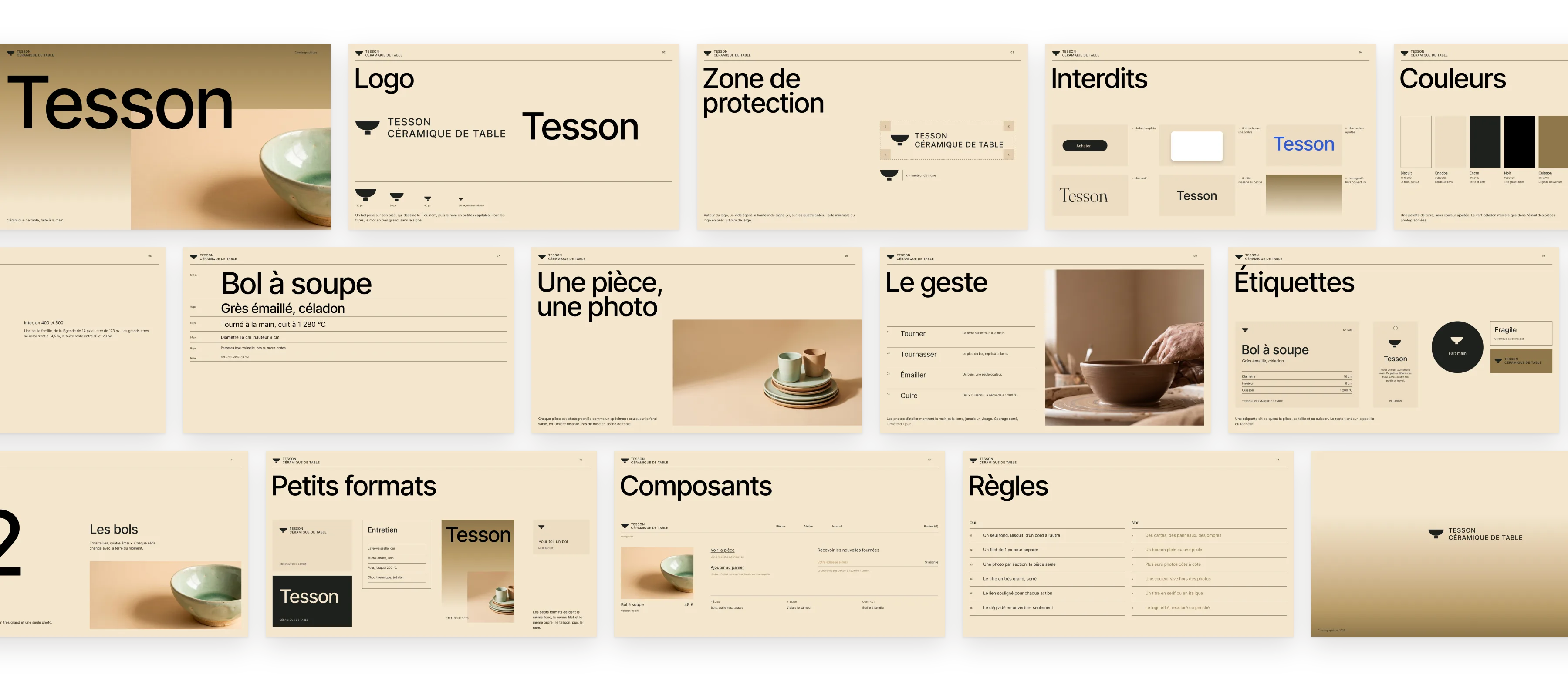
The Tesson guidelines: logo, clear space, misuse, colours, typography, scale, photography, workshop, labels, divider, small formats, components and rules.

The guidelines in use

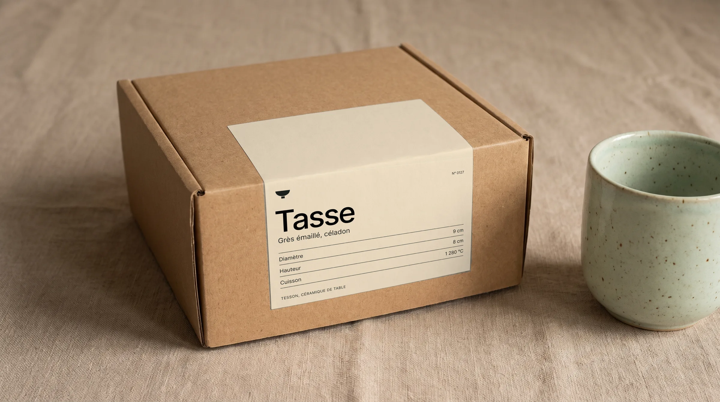
The shipping label, on the box.
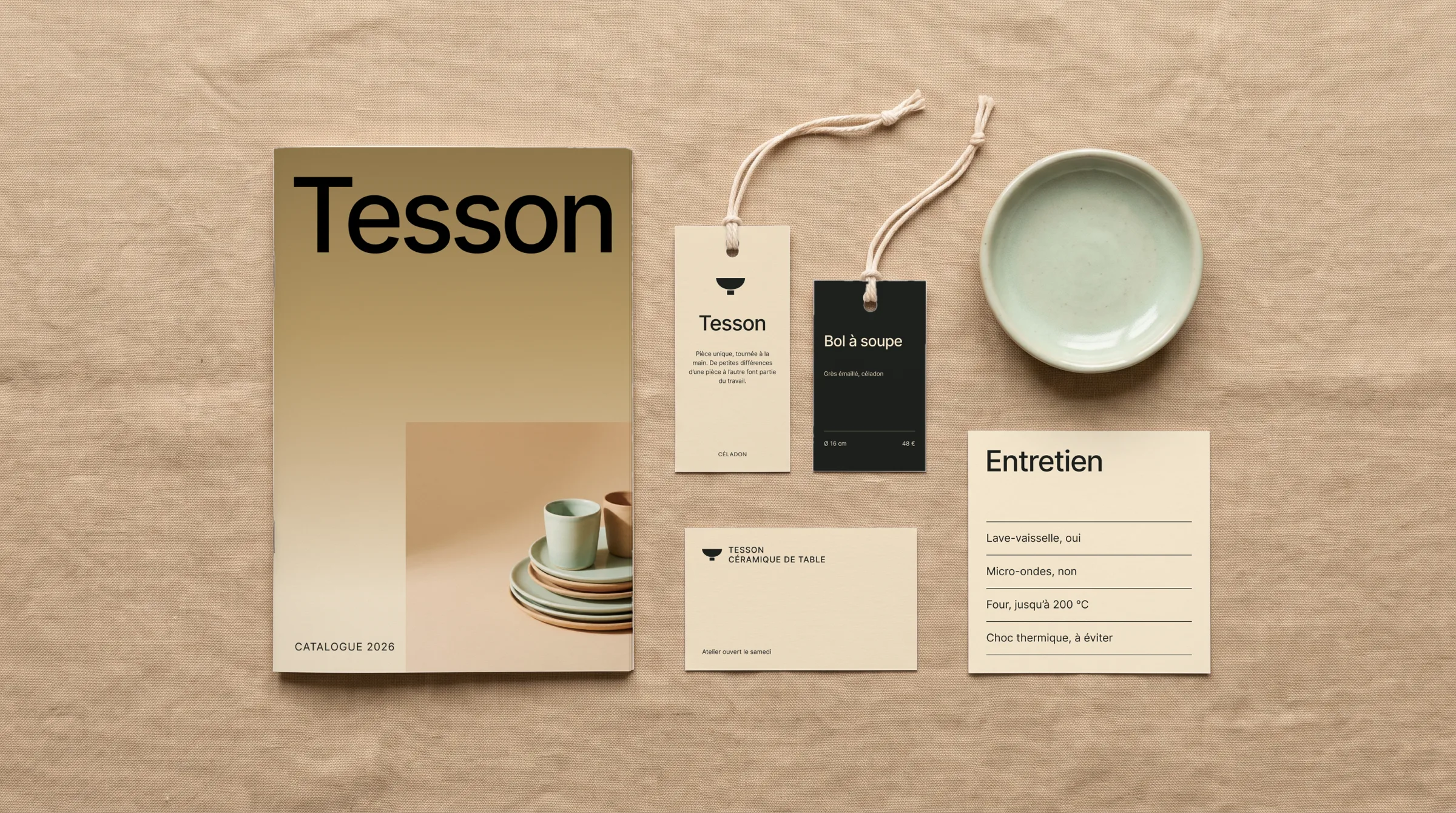
Catalogue, hang tags, business card and care card.
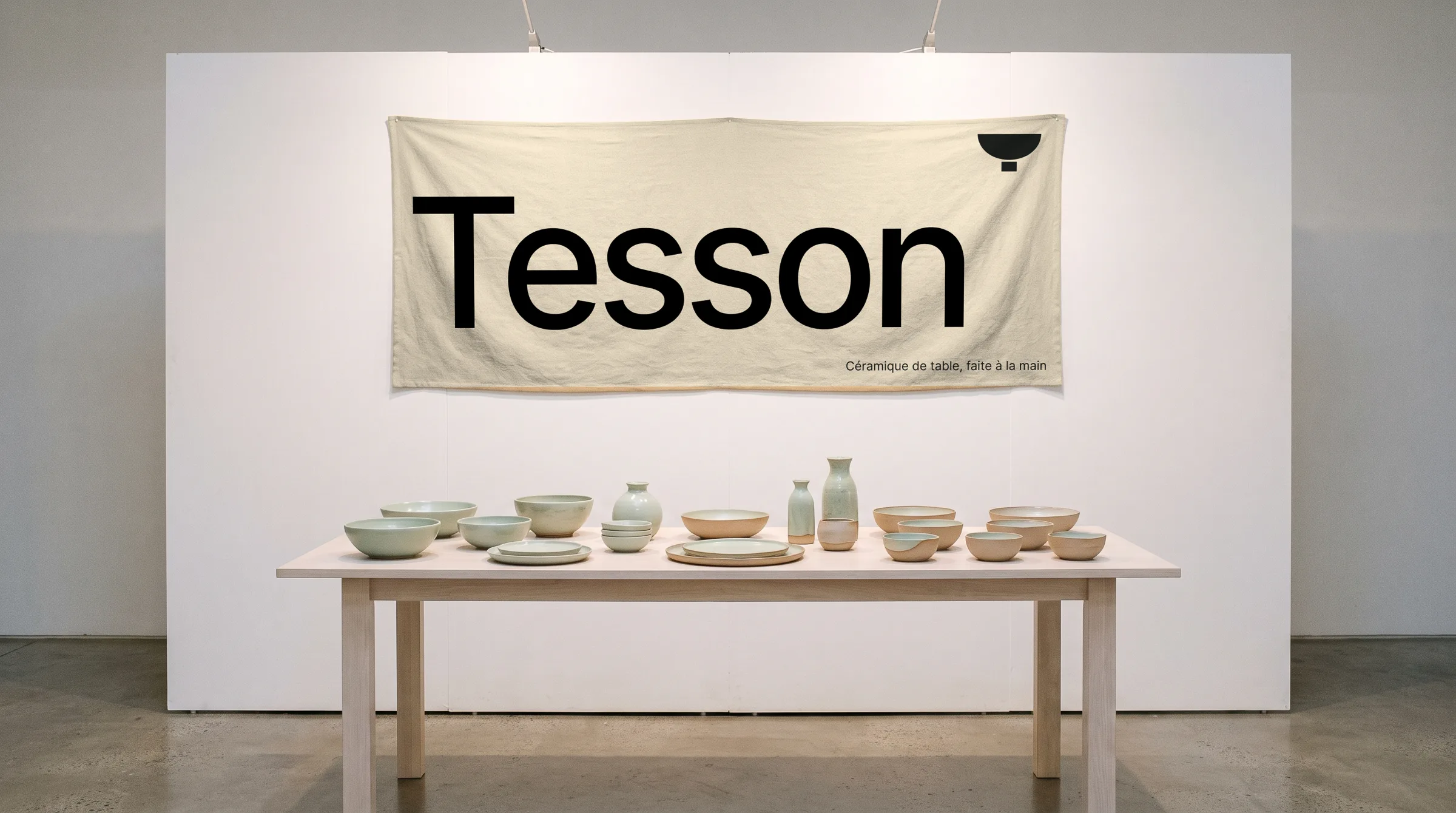
The stand banner, at a potters' market.
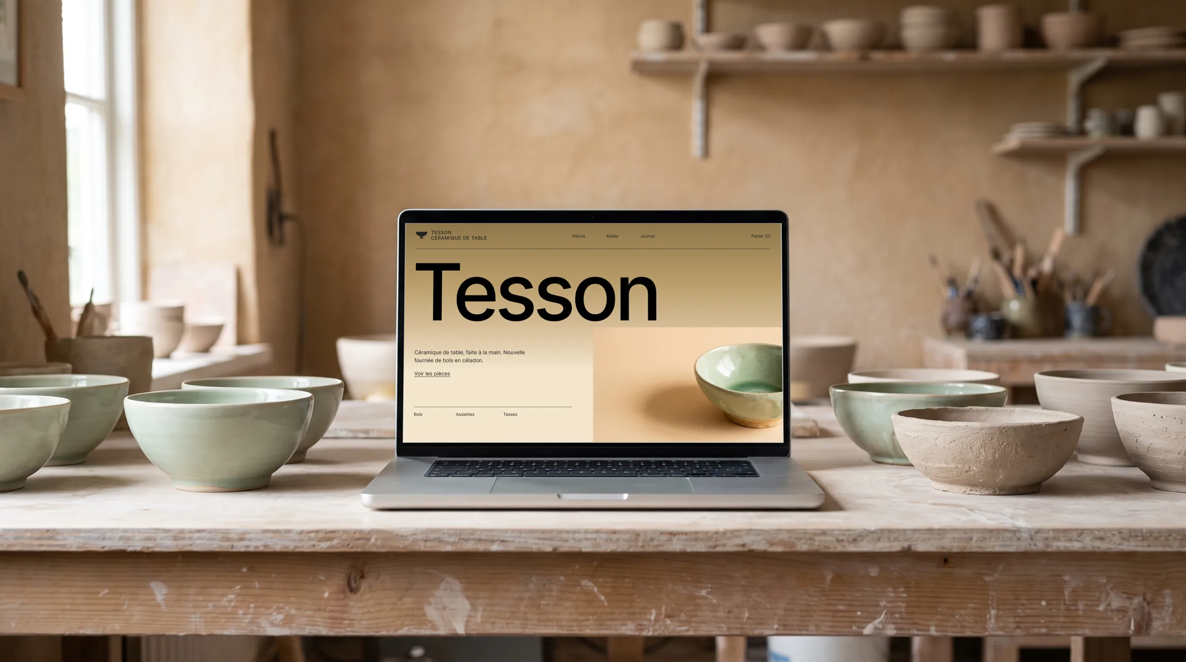
The website, on a laptop.
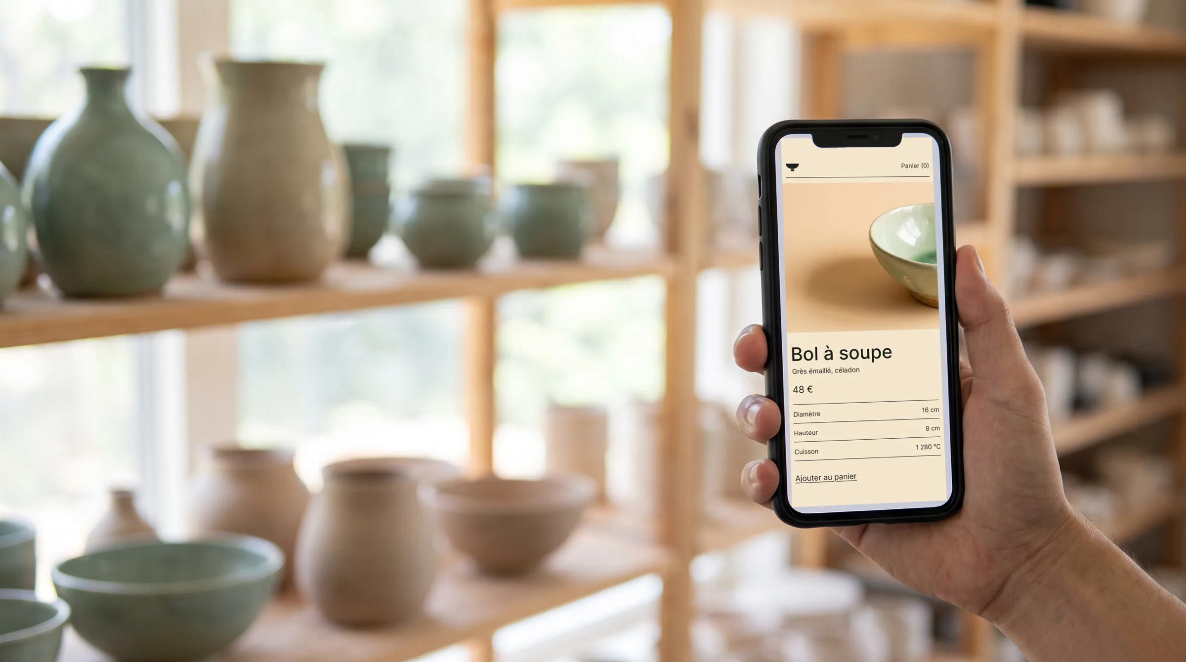
A product page, on a phone.
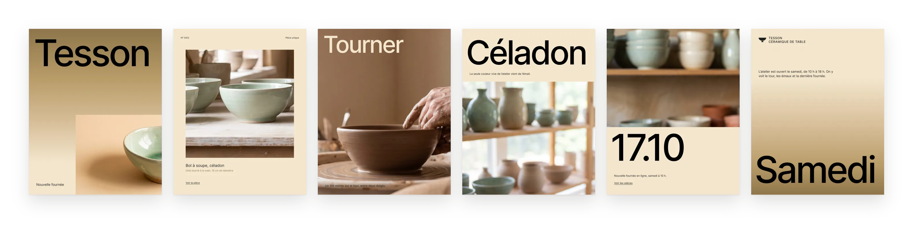
Six posts for social media.