Art direction

Ondée

The identity of a filter coffee bar and roastery.

Year
2026
At the studio
Logo, colours, typography, labels, shopfront, stationery, website, social media

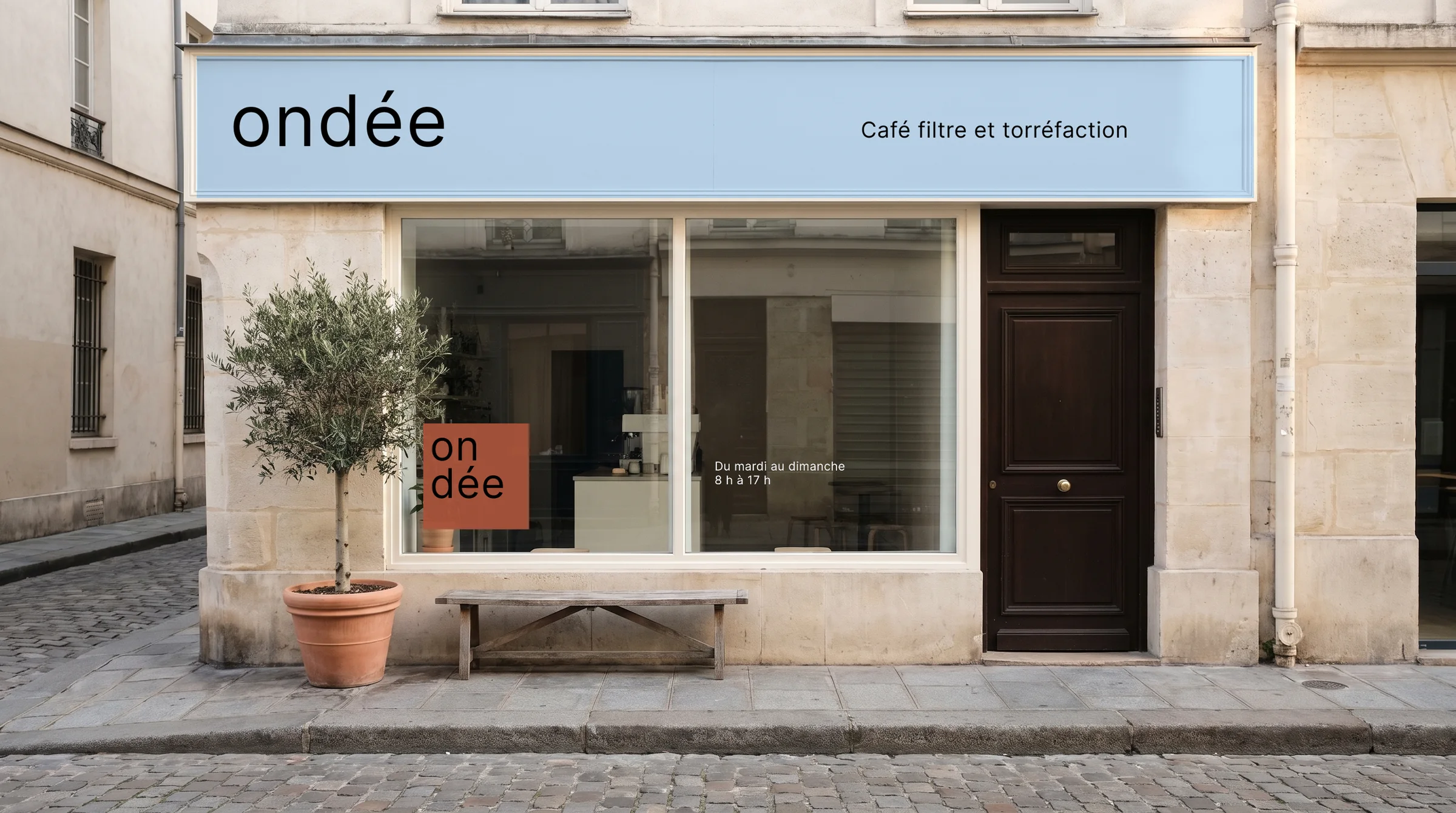
Ondée is a neighbourhood coffee bar that only serves filter coffee and roasts its own beans. The project shows a complete identity, from the logo to the shopfront.

The name sits in a tile, split in two: "on", then "dée". Everything else follows the same rule: edge-to-edge colour blocks, only two colours, roast and rain, pure black and a single sans serif whose letter-spacing opens up as it grows. Photographs join the mosaic as one more tile.

The guidelines
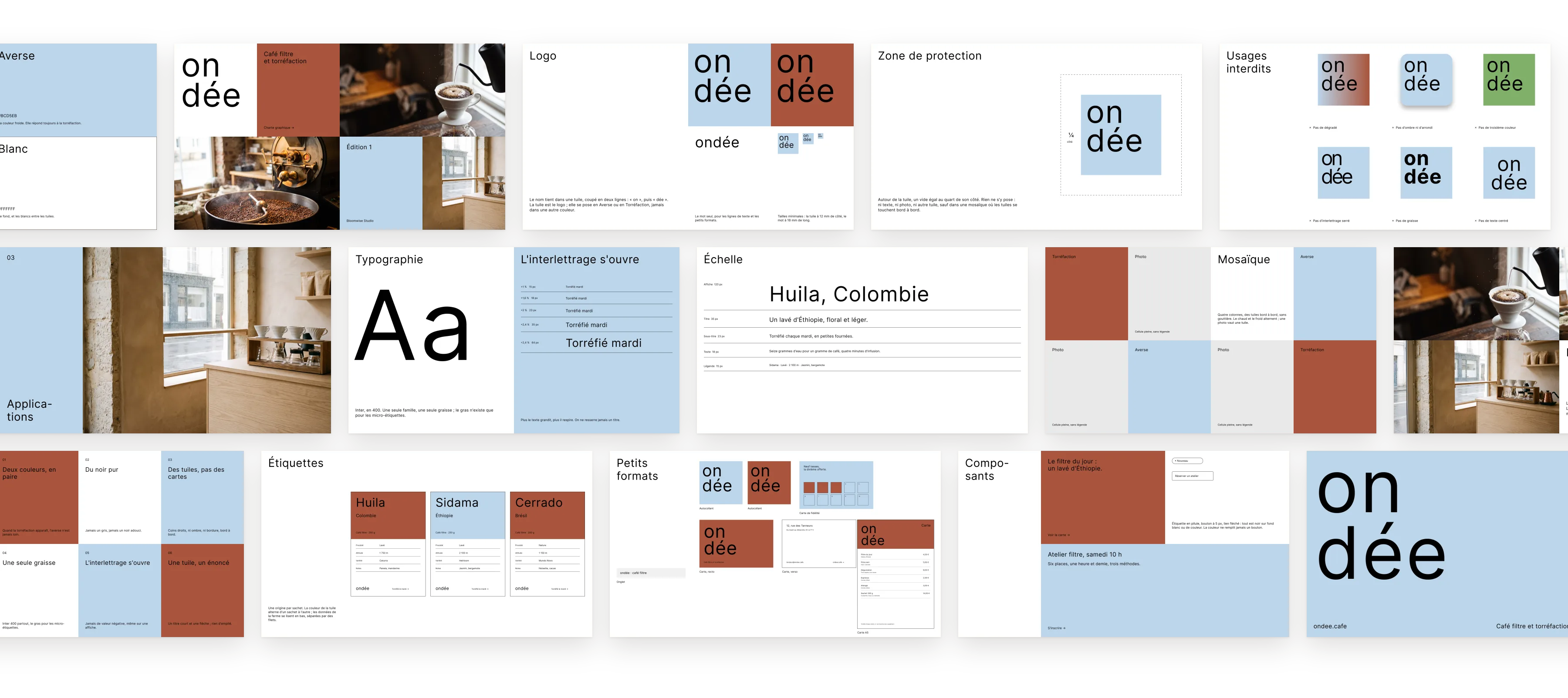
The Ondée guidelines: logo, clear space, misuse, colours, typography, scale, mosaic, photography, labels, small formats, components and rules.

The guidelines in use

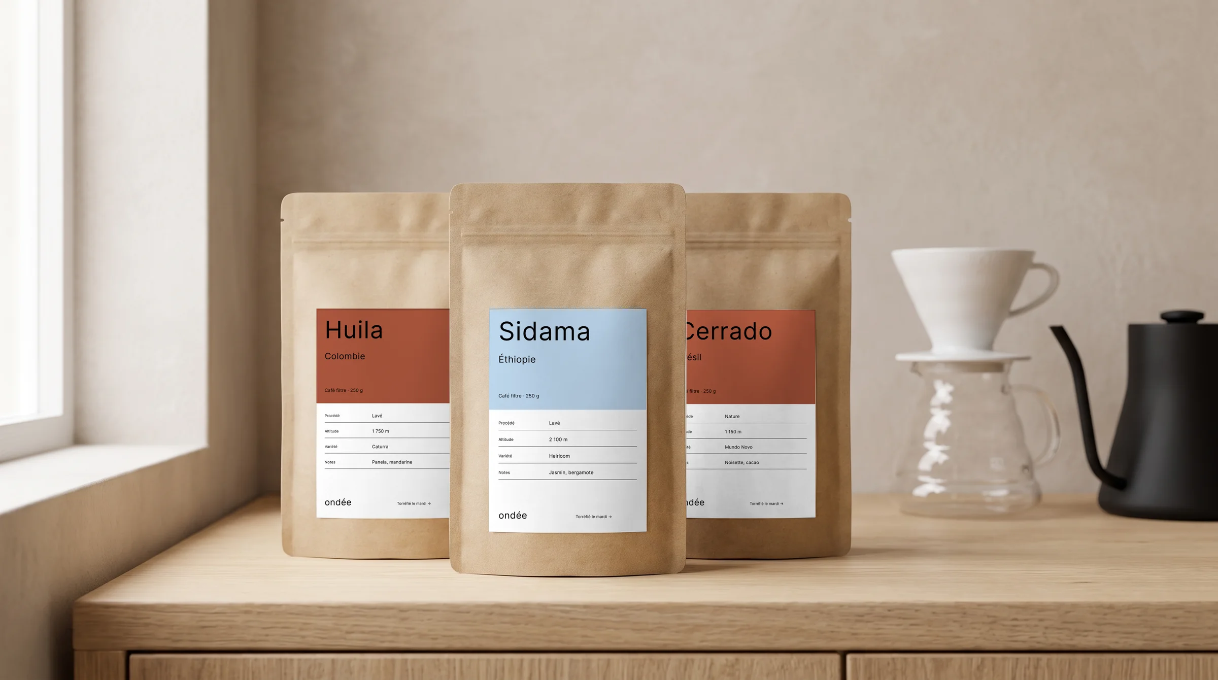
The bags: one origin, one label.
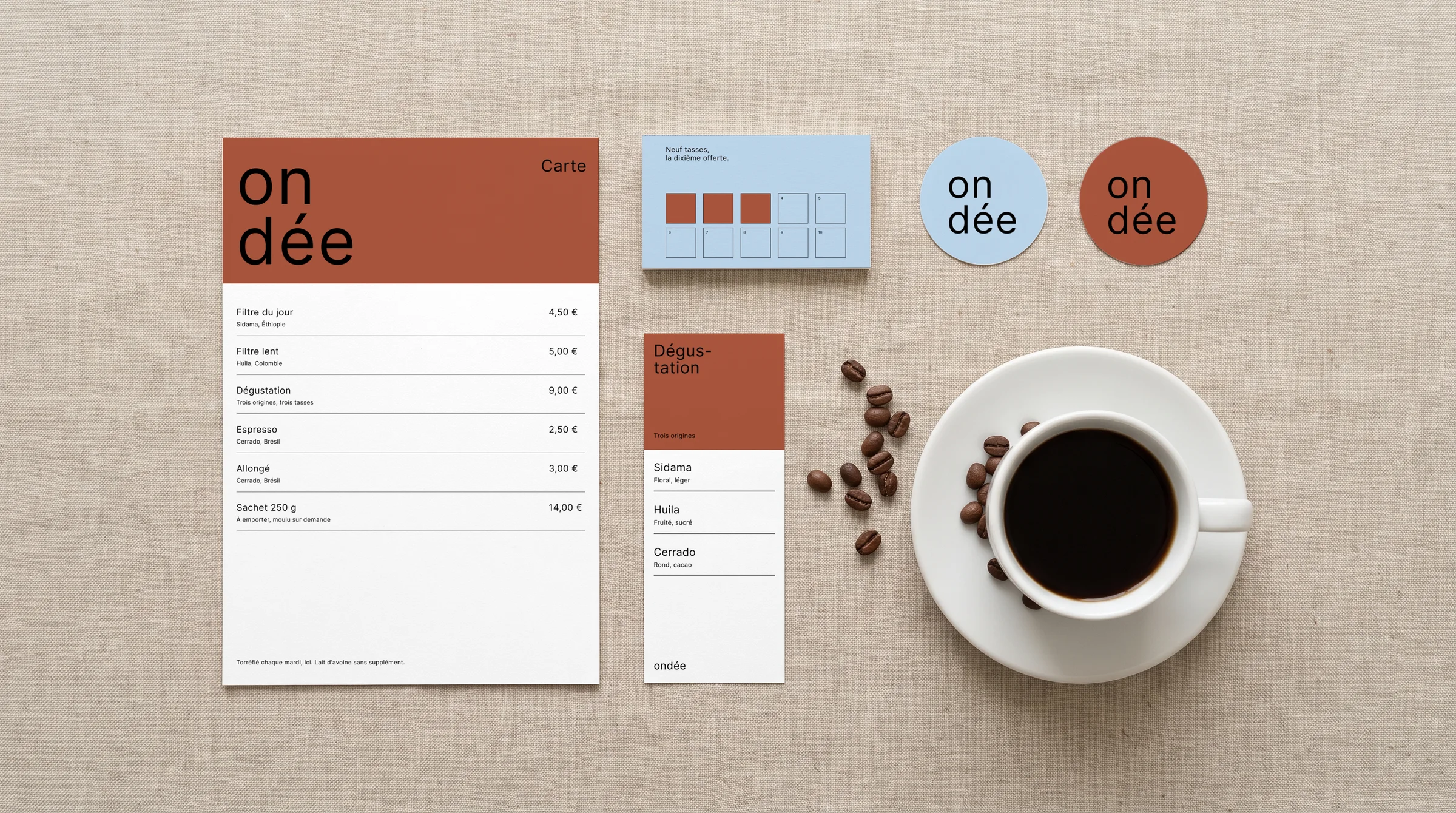
The menu, the loyalty card, the tasting card and the stickers.
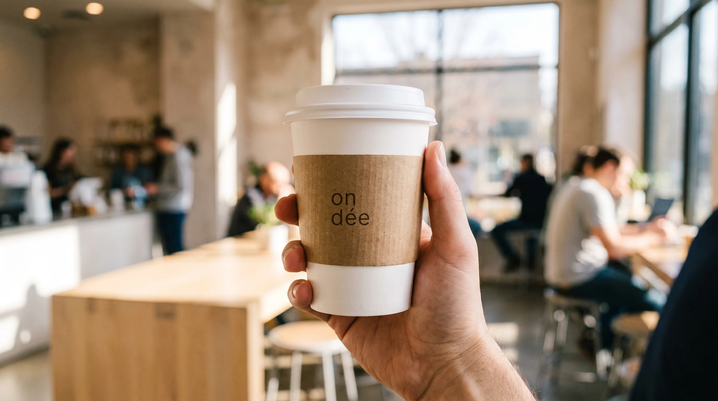
The takeaway cup.
The takeaway cup.
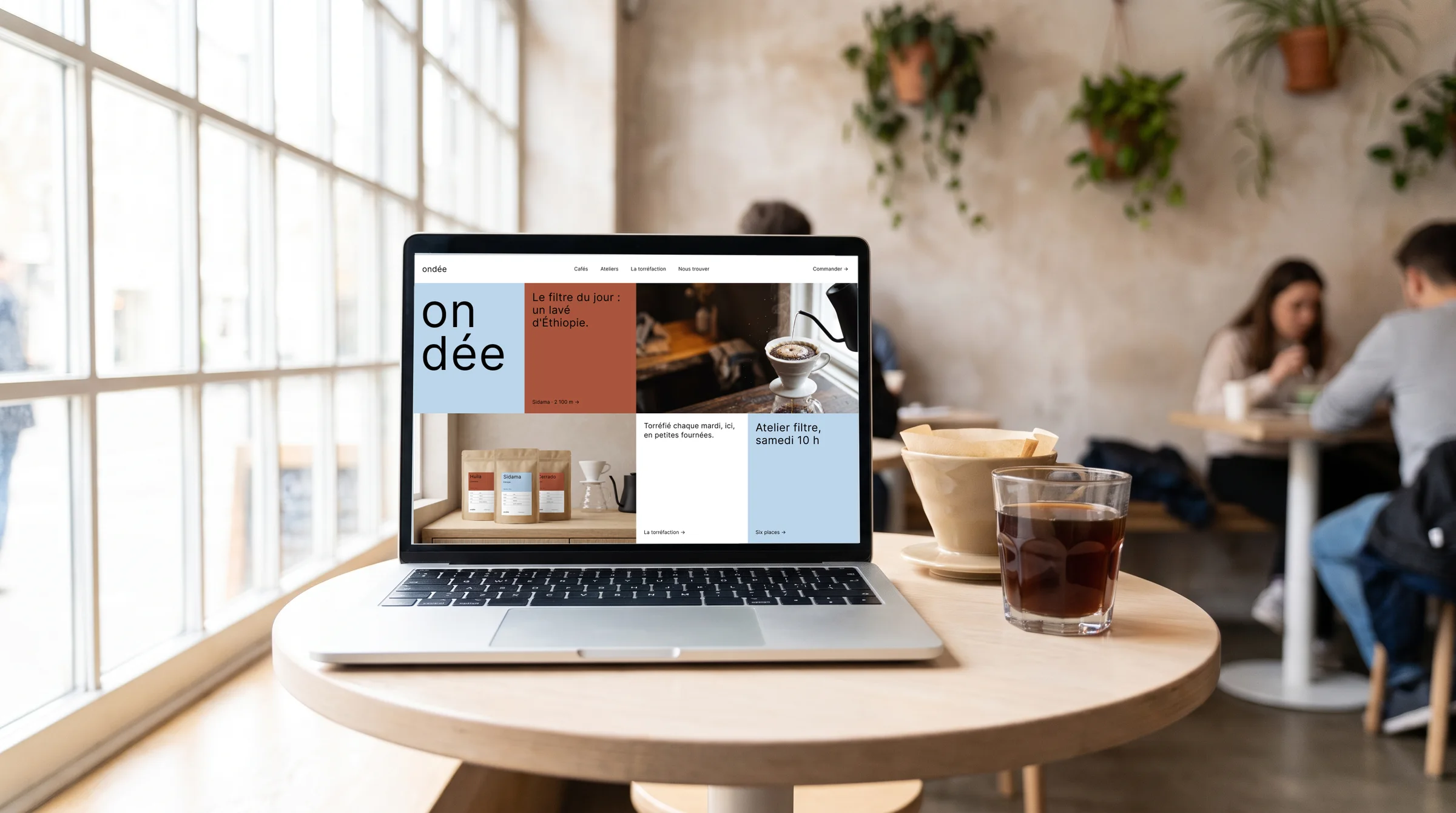
The website, on a laptop.
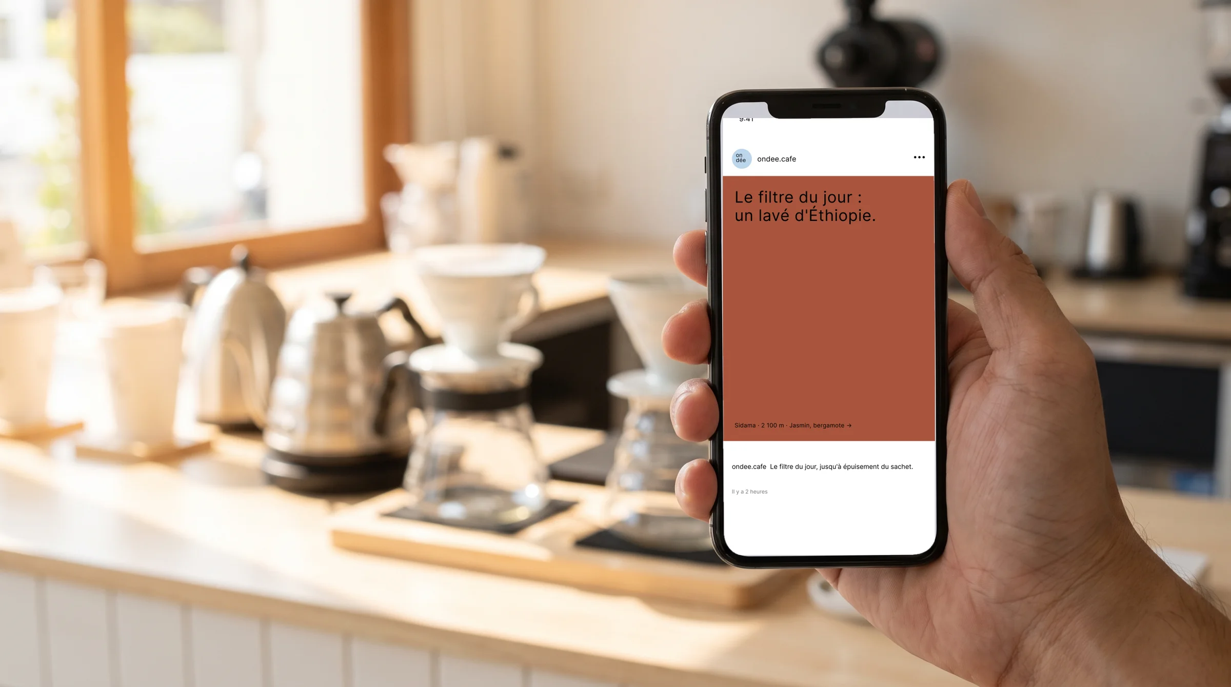
A post, on a phone.
A post, on a phone.
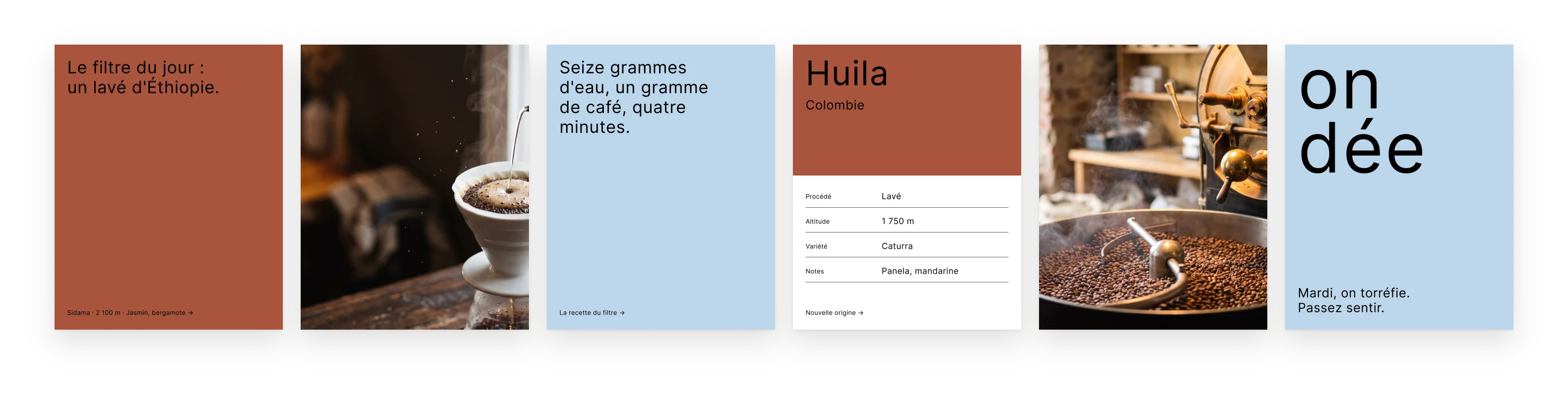
Six posts for social media.