Art direction

Givré

The identity of an artisan ice cream maker.

Year
2026
At the studio
Logo, initials, illustrations, colours, typography, menu, tubs, cups, shop sign, website, social media

Givré makes ice cream: ice creams and sorbets churned every morning with the fruit of the moment, and a menu that changes with the weeks. The whole identity rests on one drawing, in the manner of a botanical plate.

A G carved from ice, with a fruit branch winding around it. The initial changes every season, the G stays the same. The name is set in Gloock. Every flavour has its own illustration, in coloured pencil and gouache, and that is what you see first, from the menu to the lid of the tub.

The guidelines
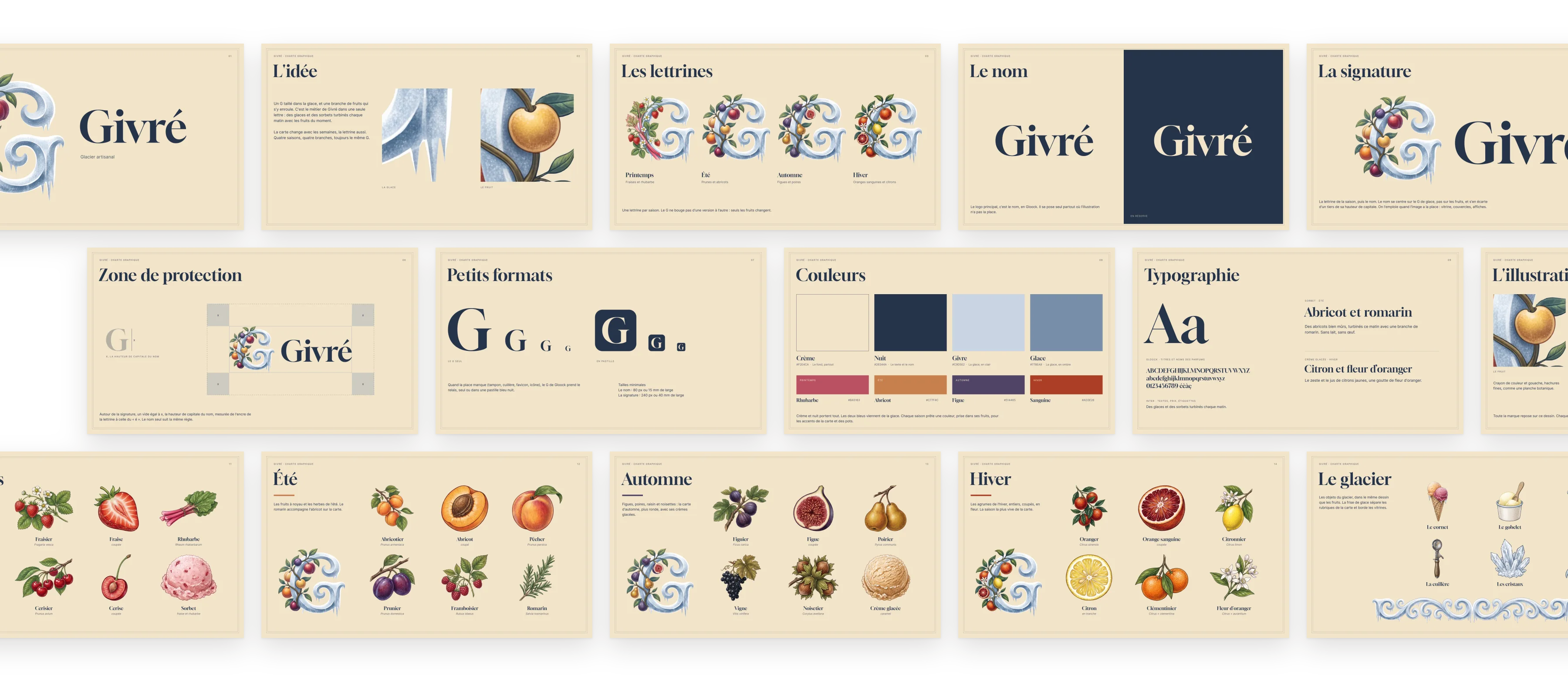
The Givré guidelines: cover, idea, initials, name, signature, clear space, small sizes, colours, typography, illustration, the four seasons and the shop.

The guidelines in use

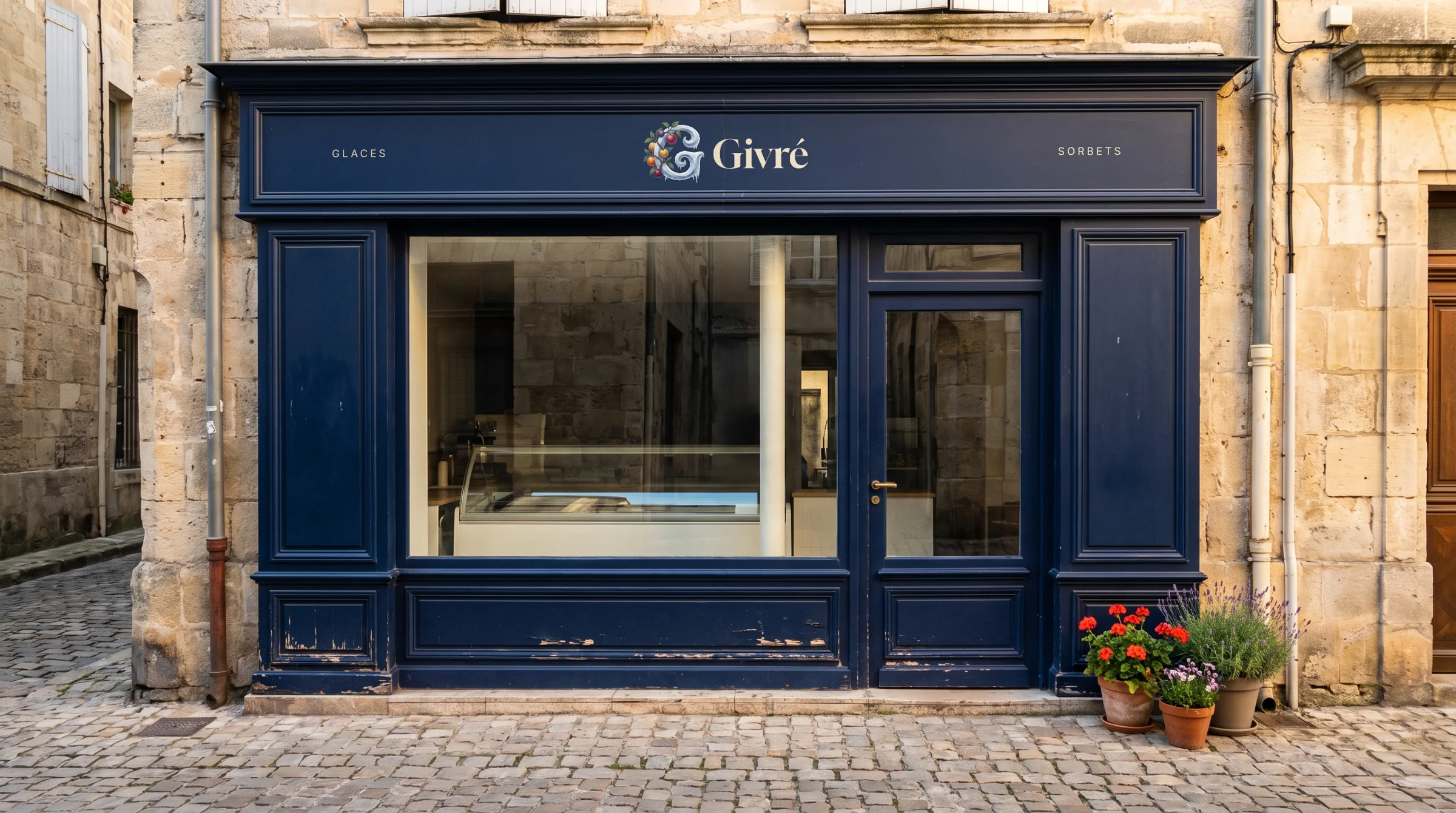
The shop sign, painted on the fascia.
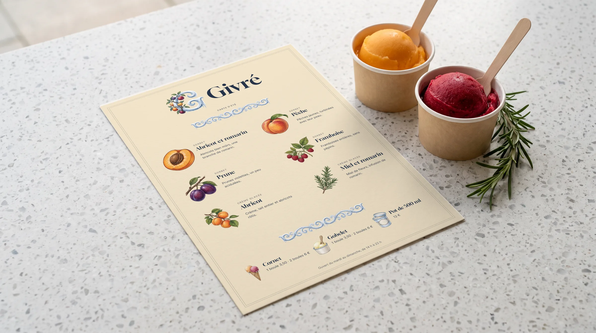
The summer menu, on the counter.
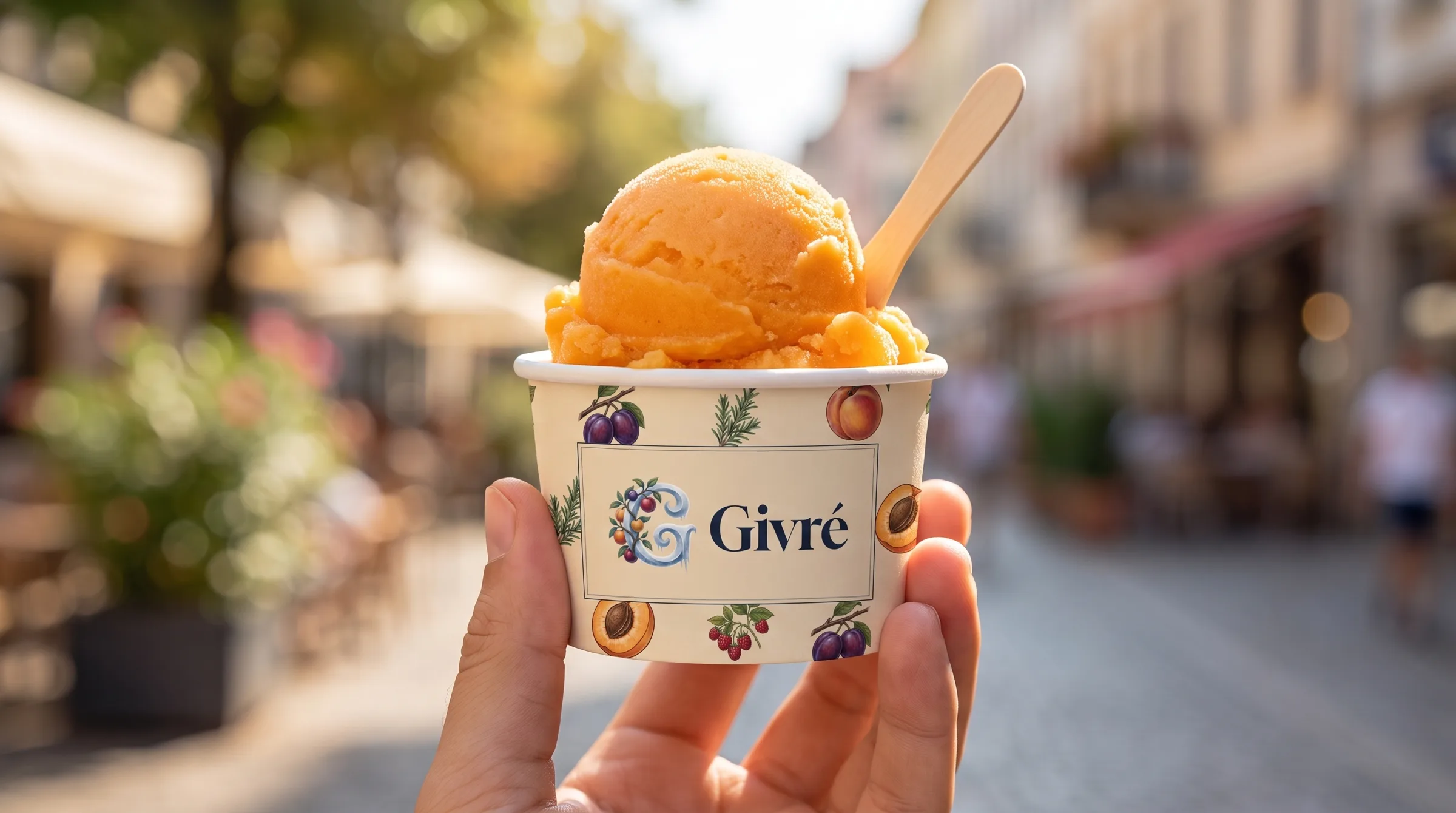
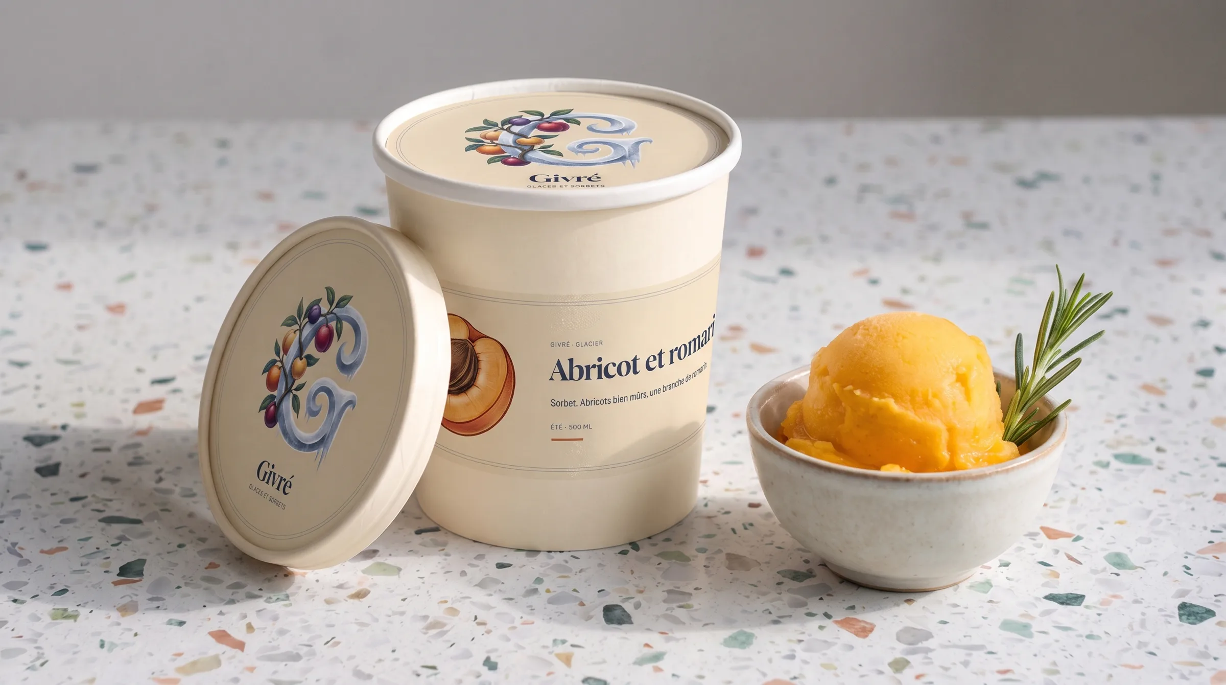
The cup.
The cup.
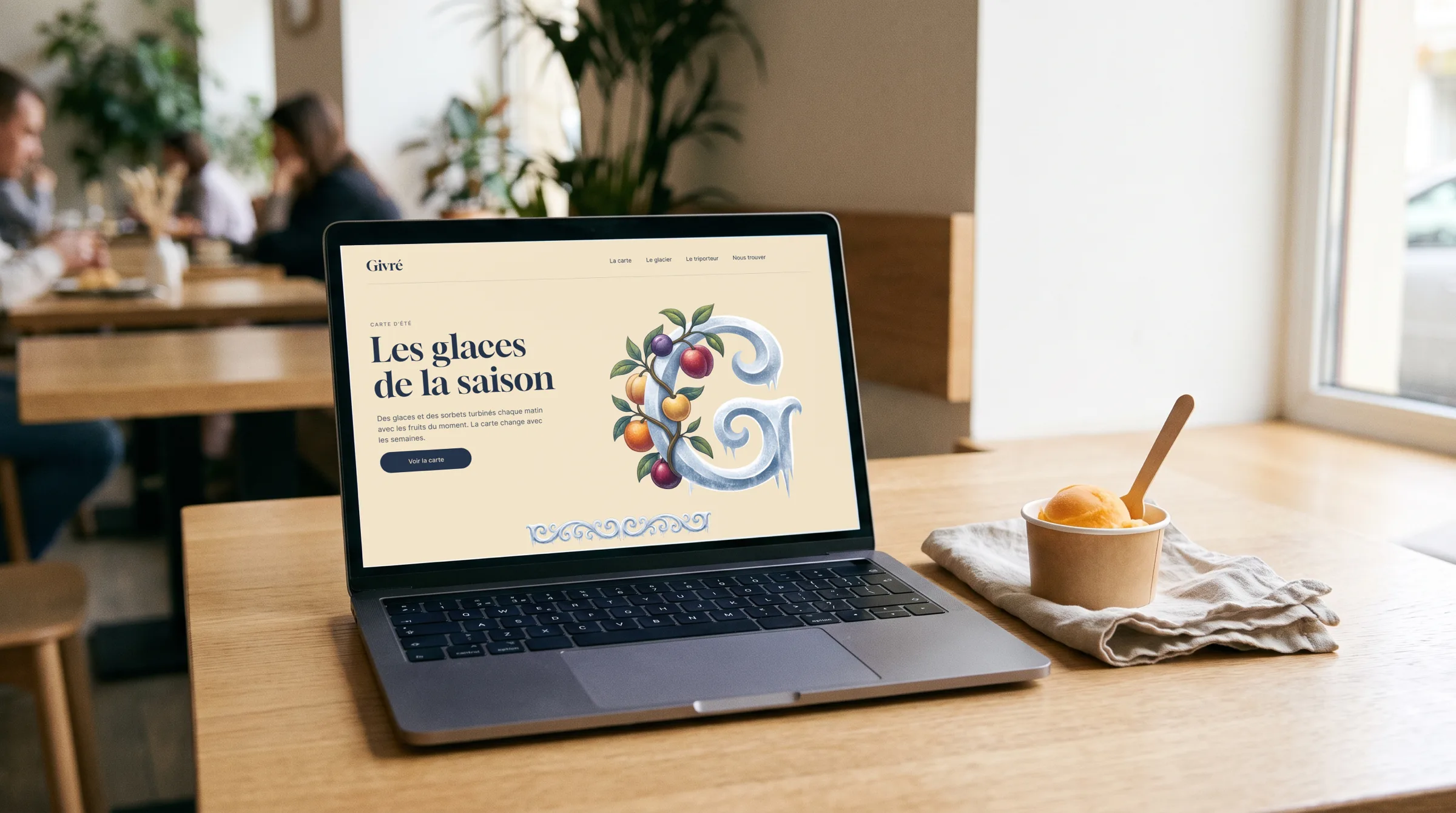
The website, on a laptop.
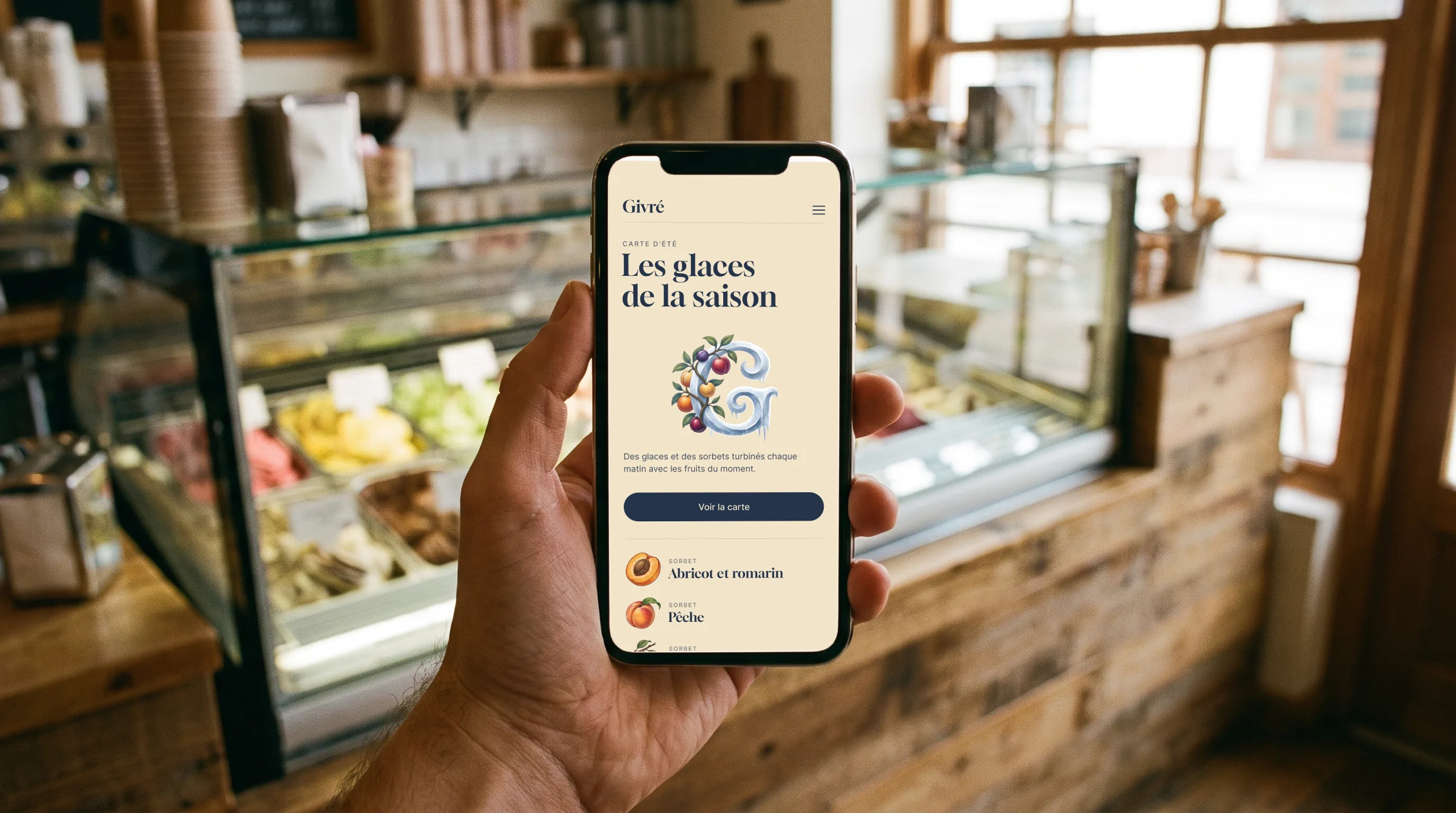
The website, on a phone.
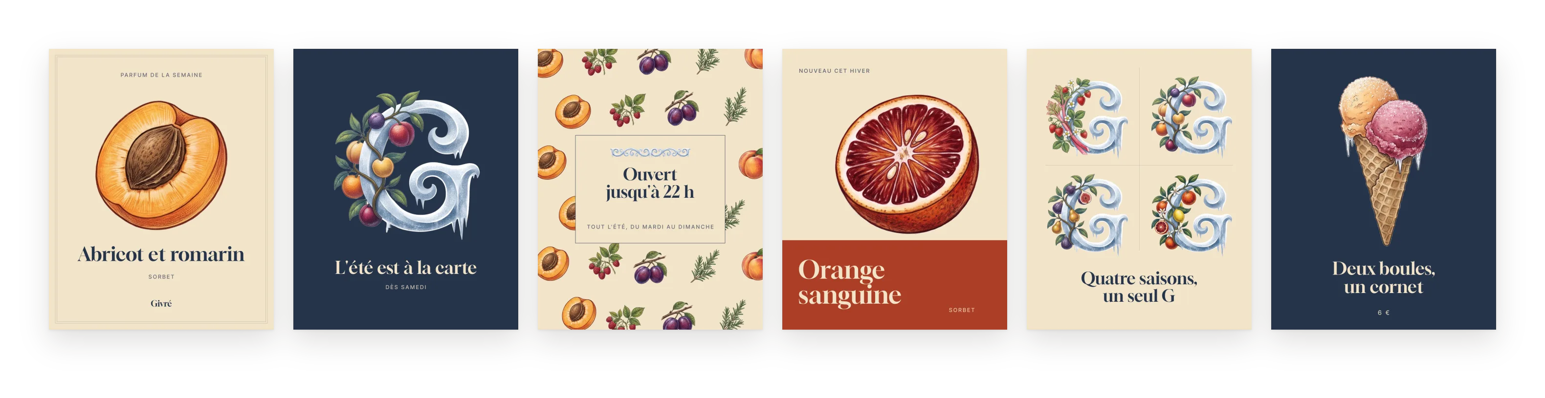
Six social media posts.