Art direction

Bloomwise.io

The logo, colours and visuals of a tool that helps businesses get found on Google.
Year
2026
At the studio
Logo, colours, typefaces, website, stationery, social media
Site
bloomwise.io ↗

Bloomwise.io helps independents and small businesses show up on Google and in the answers of assistants like ChatGPT. The studio created its whole image: the logo, colours, typefaces, visuals, website, printed documents and social media posts.

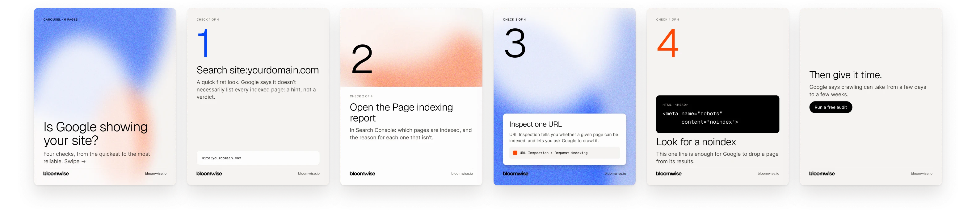
The background is light and plain, the text black. Two bright colours, a blue and an orange, are kept for the visuals. Those visuals change with every post, so no two posts ever look alike.

The guidelines
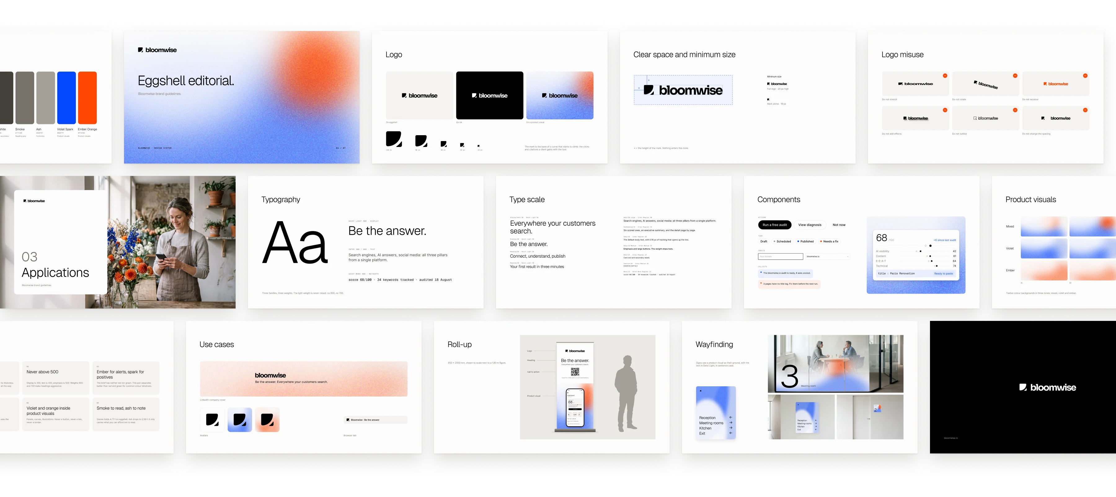
The guidelines: logo, clear space, misuse, colours, typefaces, type scale, components, rules, use cases, section divider, roll-up and wayfinding. The logo draws the base of a curve that starts to climb, the clicks and citations a client gains with the tool.

The guidelines in use

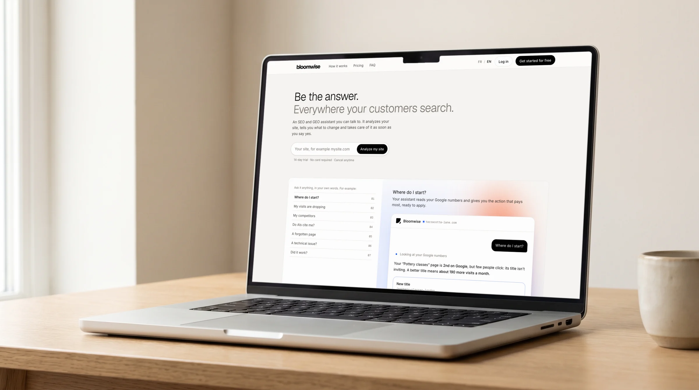
The website, on a laptop.
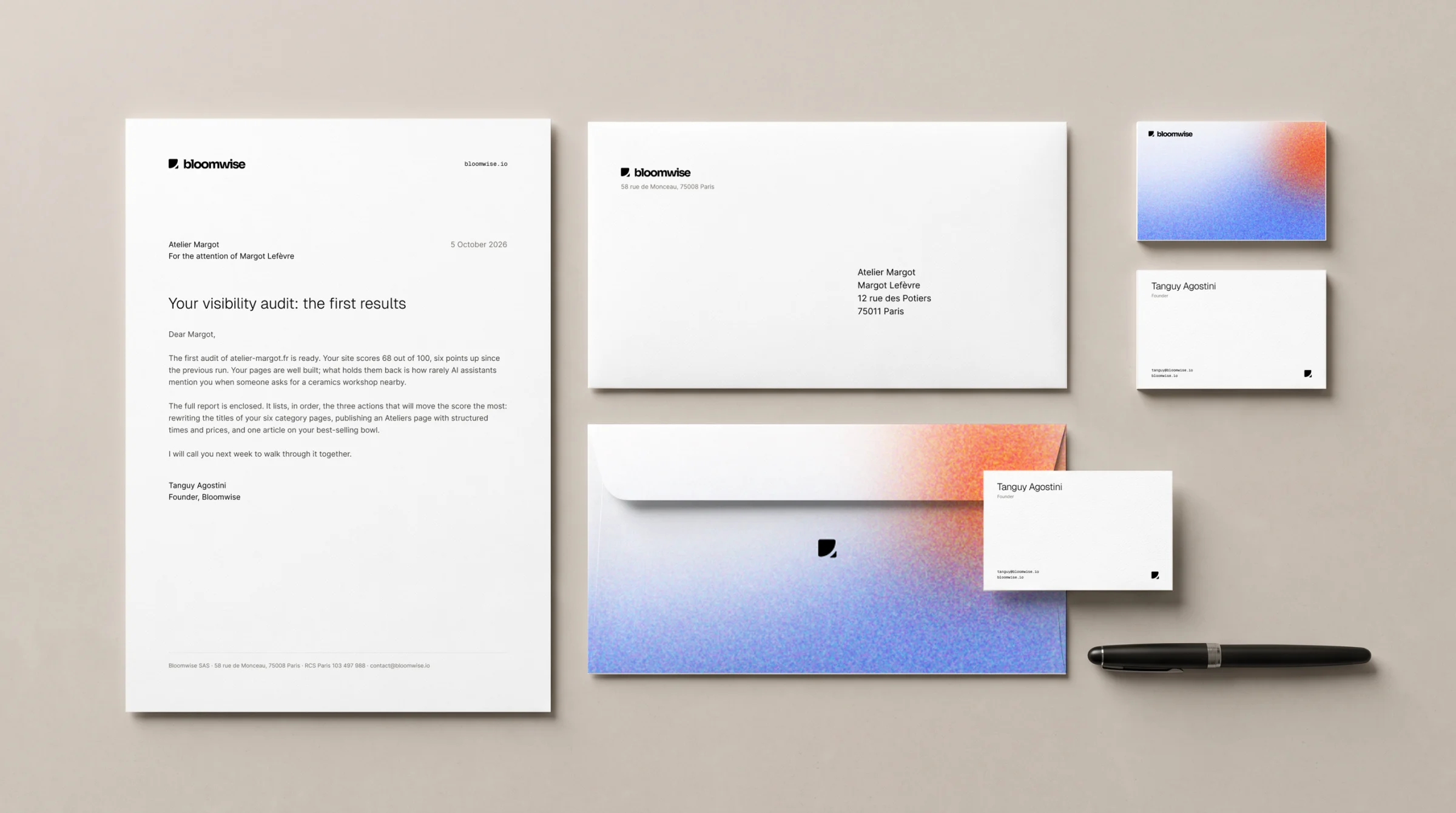
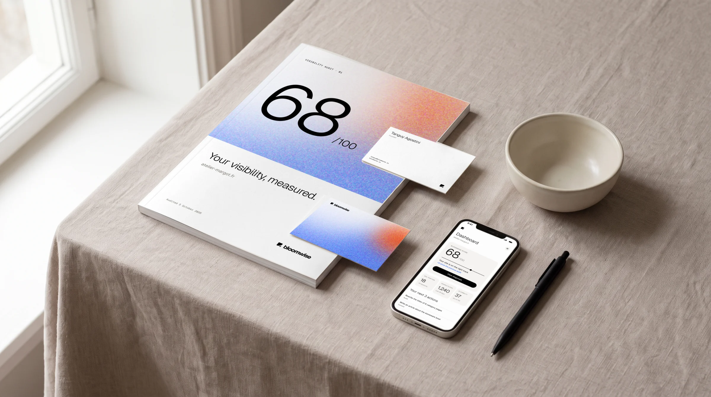
Letterhead, envelope and business cards.
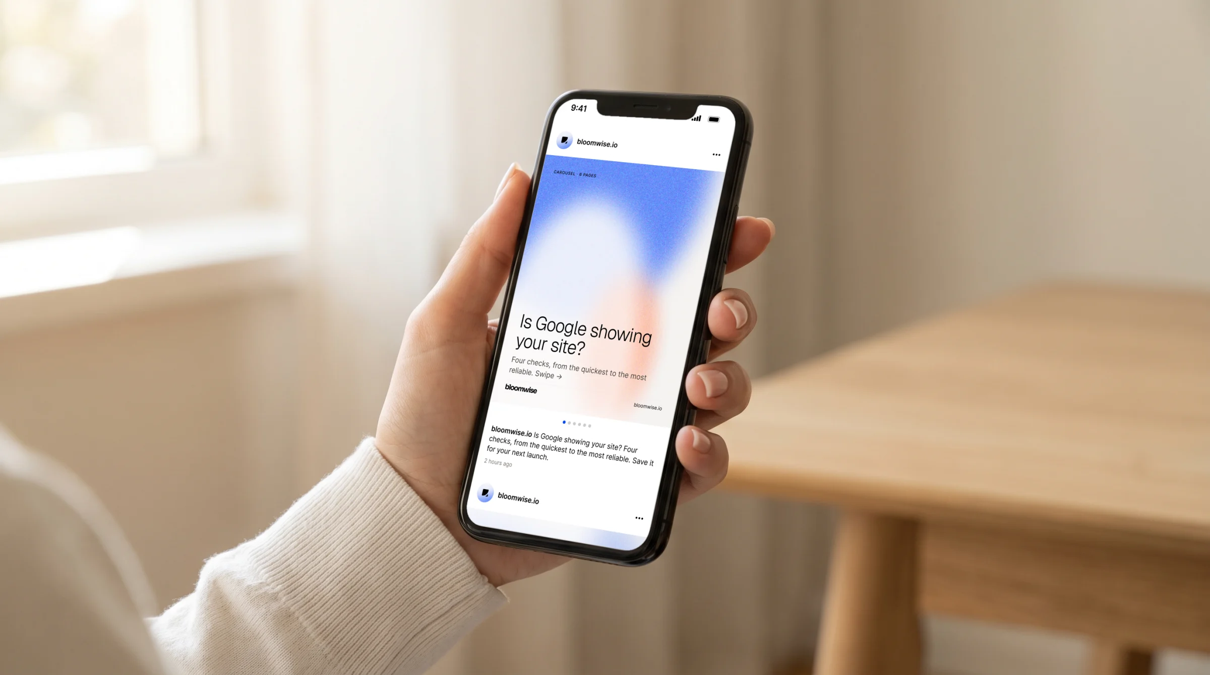
An Instagram post, on a phone.
A post in six images.
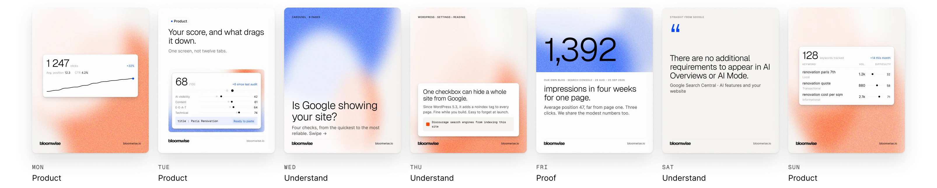
A week of posts.
A week of posts.
Visit bloomwise.io ↗